Aftenposten Junior
Aftenposten Junior was launched to meet an increasing demand to convey news in an easily understandable manner to children and youth. The solution was a quality product on par with the best media available to adults, except that it was designed with children in mind.
Client: Guri Leyell Skedsmo, editor Aftenposten Junior
Design: Christen Pedersen, Art Director, REDINK AS
Lead users:
Primary and secondary school children
Methods:
Awards:
Winner of the Innovation Award for Inclusive Design 2017 in the category of Graphic Design
30.000 editions
printed in 2018
CHALLENGE
People with the most needs often get less attention.
Today, children are constantly exposed to a stream of information primarily through digital media. However, the entire Norwegian media industry have disregarded them as consumers of serious news. The chief editor of Aftenposten accepted the challenge in 2011, when it was decided that Aftenposten had to take its social mission more seriously and give children news in a way that matched their needs.
As the target group now takes high-information, low-threshold design of Aftenposten Junior for granted, the team must strive to keep up with developments in order to maintain a loyal readership and attract new readers. Several of the visual techniques are well-known in sales promoting marketing, but have been adapted for a socially useful project. The project shows how Inclusive Design can help address challenges associated with communication across age, cultural and ethnically-diverse communities.
APPROACH
From the start of the project, the editorial staff have carried out regular user interviews during both the planning and verification phase of each publication.
The target group is mainly primary and lower secondary school children. An example of the feedback is: “If it doesn’t look good, I can’t be bothered to read it.”
The visual expression was therefore the all-important element to make the newspaper accessible and appealing to the target group. It quickly became clear that they wanted the news to be explained to them, but that such a service did not exist.
Children do not just react to visual stimuli, but are also extremely tactile. They want thick paper that they can draw on and tear up. Offering print newspapers to a target group that mainly consumes digital media was revealed as an advantage during interviews. Many parents restrict the time children spend on digital devices, therefore sitting with a print newspaper was considered positive. In addition, children find it exciting to get something in the post and like collecting print newspapers in a file.
The universal design of news is not just about tactility and the visual, but the use of language in a way that reaches out to everyone. Aftenposten Junior does not point the finger, but offers balanced journalism. Getting down to the details of an issue whilst maintaining the key elements without over-simplifying, is an art. The editorial staff can explain the challenging ideas with the right tools.
We pry into an incredibly complicated world. Writing briefly and in a user-friendly and comprehensible way requires extensive work. We read a lot about conveying news to children, which is also their democratic right. Children accept the world as it is and that nothing can be done about it. But, of course, with knowledge it can be changed. They discover the power of participation and impact.
RESULTS
By utilising the power of graphic design tools, the newspaper has become a success and is now used by both children and adults including non-native speakers of Norwegian. It has become an important platform for presenting Norwegian language, society and culture to anyone needing simple and direct communication that does not lose the essential messages.
Aftenposten Junior has noticed that others are following suit. Although the design was developed five years ago, the principles have stood the test of time showing that a universally designed framework can be used in different ways, and lead to radically creative outputs. The visual techniques make it easier to absorb more intense news items.
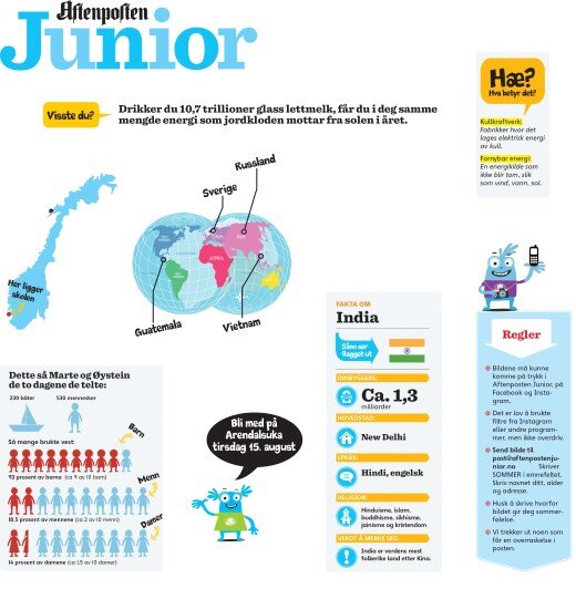
The designers and editorial staff have developed a set of tools to convey news using different types of input. Tags, titles and images function as part of the main text or just as a ‘fact box’. The explanation of words, captions and other individual elements play an important role when brought together. Questions and answers are presented in an interview format to allow the reader to concentrate as well as reflect on what they are looking at. They also used cartoons with great success to deliver an innovative way of conveying news that is easily transferable to other media.