Skatteetaten.no tax service
Skatteetaten.no manages to communicate a complex and bureaucratic set of regulations for the whole population of Norway in an easy way by incorporating inclusive design throughout every aspect of the framework
Client and designer: Skatteetaten
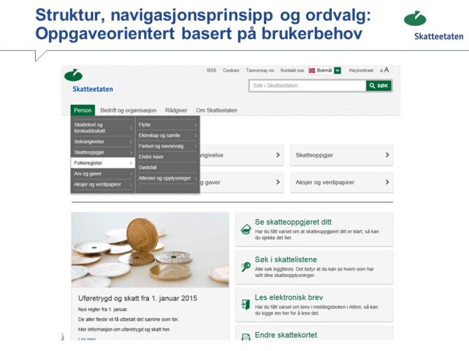
Background: Skatteetaten.no is a website that contains information about the regulations that apply to tax, fees and the National Registry in Norway. It is a website that most Norwegians must relate to in varying degrees, so the interface should appear both easy and intuitive for everyone.
In Norway, new regulations for universal design of information and communication technology (ICT) were approved June 21st 2013 and took effect July 1st 2013. This means that new ICT solutions should be universally designed from July 1st 2014. Existing ICT solutions should be universally designed from 2021. Read more here.
Lead users:
Users with cognitive disabilities, senior users
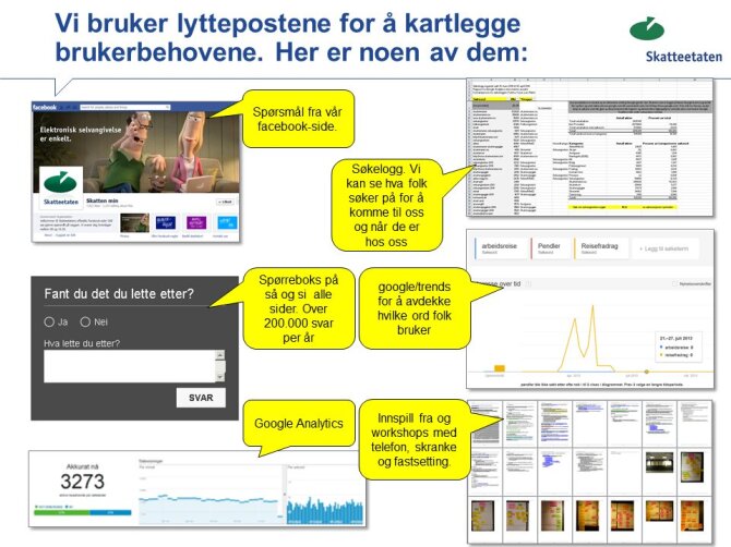
Methods:
User research, user testing
Awards:
Winner of the Innovation Award for Universal Design 2014 in the category ICT
.
CHALLENGE
Skatteetaten.no is a website that contains information about the regulations that apply to tax, fees and the National Registry. At the same time, it is an entry point for the services provided by the Norwegian Tax Administration. The target groups are very diverse – everyone from everyday individuals who may not think about tax very often, to business people and professional agents. The latter must have both the overview and ability to access the details of many complex regulations.
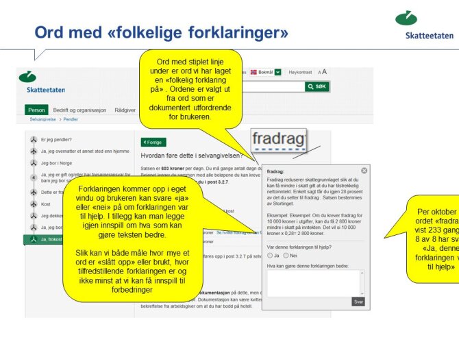
One challenge that often came up was the use of concepts defined by the Norwegian Tax Administration, and concepts defined by users. Words and expressions that they consider to be simple may be misunderstood by the users, which may lead to errors. This was one of the problems that were addressed during the design process of the new website.
APPROACH
When the Norwegian Tax Administration started to build a new website, they had already spent over a year on mapping, analysing, testing and ensuring that the new website could be supported. This preliminary work resulted in a framework with three fundamental principles: A target that the users should find, understand and be able to complete whatever task they needed to. A strategy that the Norwegian Tax Administration should provide guidance for all types of user. And finally, a work process, that included mapping user needs and internal needs, giving priority to the correct measures in the correct channels, and user testing before launch. While planning the deliverables, strategy and work process, it was essential to use simple language and incorporate inclusive design.
By striving to ensure that everyone has equal opportunities to understand and appreciate their rights and duties, we have created a list of the things we must have in the design of information and services.
Creating the conditions required for simple communication also means using the principles of universal design, working continuously with navigation and interaction, testing new concepts and solutions, and not forgetting what is important for the users. It doesn’t take much for people to lose their focus and interest. Therefore the content have been divided into sections, in order to counteract this. The website visitor sees what he or she needs, and nothing more.
Helping those with cognitive challenges means removing as many distractions as possible, giving the user the confidence that he or she correctly understands the tasks, whilst providing context-sensitive help if necessary. For text, this means in practice using words that the user recognises, writing short sentences, avoiding abbreviations, and giving alternative configurations where they are useful. For the design and interaction, it means to maintain a predictable and logical structure, and avoid introducing too many changes in the framework, navigation principles or design.
RESULT
So what’s the result? It’s not easy to measure the benefits, without defining what “benefit” means in such a complex context.
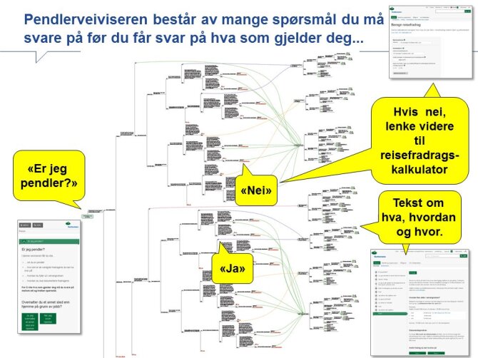
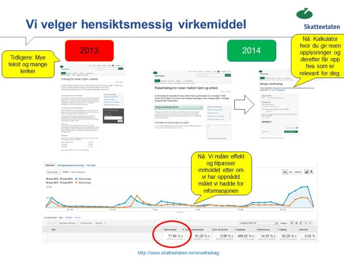
The Norwegian Tax Administration has worked with the commuter guide for some years to determine the effect that the information has had. The provisions of two massive sets of regulations have been disassembled and put back together again, so that users can address the questions that they will, most likely, be able to answer. The alternative replies are ‘YES’ and ‘NO’, and these are mutually exclusive. User tests show that people actually know whether they are married or not, and can successfully answer this question. People also know whether they are older or younger than 22 years. When the user has replied to all questions, a text is presented that shows both what they should do and how to do it.
All the answers are not in yet, but there are some indications: Externally, there was an increase in traffic of 240% for the commuter guide from the level of the previous corresponding information in the same period of time. Further, it is clear that the commuter guide has a positive effect on enquiries both by telephone and in person. The number of enquires in person has fallen, but the questions that are posed by telephone are more complex than previously. Feedback shows that people do not ask as frequently about matters that the commuter guide can help with.
It’s easy to make something complex, but you do not necessarily have to be complex to make something simple.