Municipality of Oslo – a holistic and unifying identity
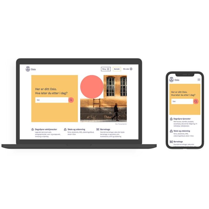
Design agency Creuna (now Knowit) and the Municipality of Oslo has developed a user-friendly, flexible and unifying identity for Oslo, one that makes municipal services more understandable to citizens, and therefore strengthening the local democracy.
Commissioning party: Municipality of Oslo
Design: Creuna, now Knowit
Lead users:
Citizens, employees, community representatives
The Norwegian Association of the Blind and Partially Sighted
Norwegian Dyslexia Association
Methods:
User involvement, prototyping and testing, consulting
Awards:
Category winner for graphic design, Innovation Award for Universal Design 2020
100 %
online accessability
Identity for over 700 000 citizens and 50 000 employees
Challenge
With around 250 different visual identities and an old design manual from 1997, the Municipality of Oslo did not have clear guidelines for communicating visually in print or digital media, and there were no regulations in place for universal design. Consequently, the municipality came across as fragmented, and it was difficult for citizens to comprehend which services and activities the city offered.
Oslo has a population of over 600,000, and the municipality has more than 50,000 employees. The project's goal was to make the municipality of Oslo more unified, accessible and easy to understand for its citizens and make it easier for its employees to communicate the municipality's role as a service provider, community developer, governmental agency and employer.
Methods
The new identity needed to be simple and accessible to a wide range of both citizens and employees. Universal design was, therefore, a requirement from the very start and the process included a high level of involvement. More than 1500 citizens, business community representatives and various municipal employees actively participated in the project.
Numerous concepts and hundreds of sketches and prototypes were tested, making it possible to identify universal solutions throughout the Municipality of Oslo' complex organisation. Using an inclusive process, Creuna and the municipality succeeded in creating engagement and enthusiasm among municipal politicians and employees.

Lead Users
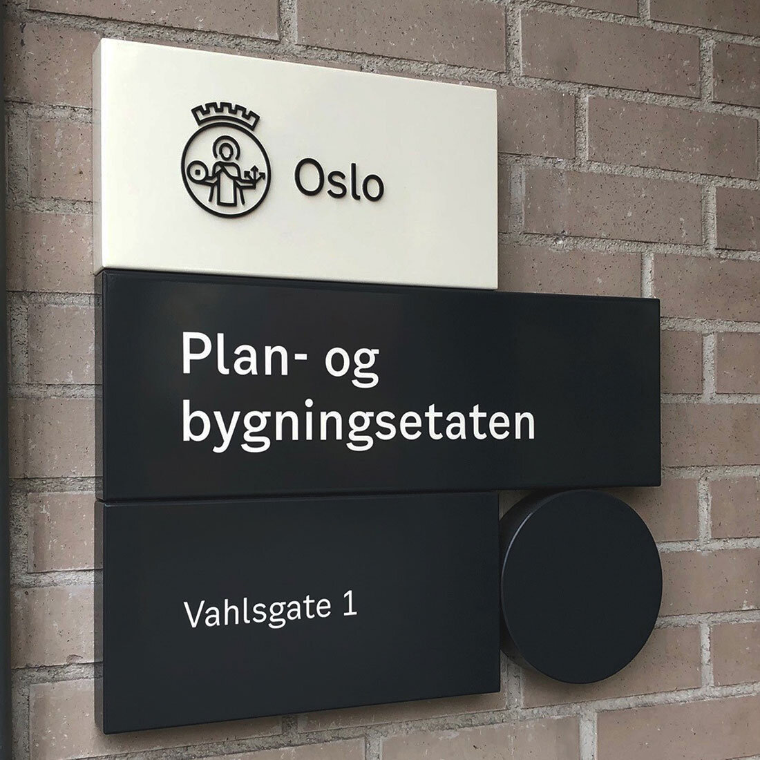
The Norwegian Association of the Blind and Partially Sighted was also involved in the project testing the logo and font. Of particular importance was feedback from the partially sighted, who could better see and understand the new logo – which is a simplified version of the existing coat of arms, previously saturated in so many colours and details that it had become unclear.
Norwegian Dyslexia Association also provided valuable advice. It was essential to develop a clear language to be used across the municipality to make communication easier to understand for everyone.
The Municipality of Oslo’s new identity and logo are easily recognisable and are based on a universal design. Oslo now has a user-friendly, flexible and unifying graphic profile that makes the municipality clearer to citizens and strengthens local democracy.
Insights
When developing the identity, it was also important to make a design tool that enables all municipal employees to easily create their own design products without using design software or have design expertise. This tool makes the identity accessible to more people, provides employees with a sense of mastery and guarantees that the result will be consistent with the identity framework.
The design tool can build design products with a high degree of flexibility, much like LEGO bricks, ensuring both considerable diversity and high recognisability. The comprehensive and user-friendly toolbox has made it easier for all municipal departments to implement the new identity.

Results
In accordance with a recent politically adopted communication strategy, the Municipality of Oslo now appears more unified. The new visual identity helps achieve this goal and is to be used by all municipal departments and services.
The identity has many communication forms, making it possible to reach a wide audience and to communicate Oslo's core qualities: proximity and diversity. Symbols and elements are distinct and easy to understand. Colours, fonts, icons and illustrations of buildings innovatively reflect Oslo's urban landscape and provide an extensive visual library. Using 3D innovations and sounds of Oslo as extra dimensions, the identity uniquely succeeds in capturing Oslo's pulse. This use of auditory, visual, simple graphic and recognisable icons creates a rich and vibrant identity. Also, it makes it possible to communicate with the visually and hearing impaired and those with cognitive challenges.
As well as being easy to understand, the new identity satisfies universal design requirements. Online accessibility via the official municipal websites is 100 per cent. The innovative design tool developed for municipal employees meets WCAG 2.0, and enables a wide range of employees to effectively communicate with their target groups .
The Municipality of Oslo's new identity and logo result from an inclusive process and present the city's services and activities in an exemplary manner to a large and diverse target group. This achievement awarded the project Design and Architecture Norway's Innovation Award for Universal Design 2020 in the category of Graphic Design.