Fukuoka City Subway
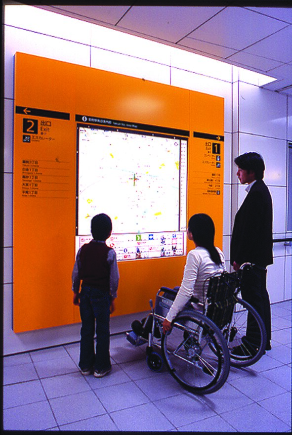
The subway in Fukuoka City in Japan demonstrates an exemplary approach to Inclusive Design. Over a ten-year period, 16 stations, facilities, signage, rail-yards, ventilation towers and subway car designs were developed and implemented. Research was conducted with a diverse range of travellers, all with different needs and demands.
Client: Fukuoka City Transportation Bureau, Japan
Design and user research: Toshimitsu Sadamura, GA-TAP Inc.
Background: The city subway project in Fukuoka City in Japan started in 1995 and opened in 2005. It is one of the first transportation systems in the world to have a comprehensive Inclusive Design approach
Lead users:
People with litmited mobility, people with limited ability to access information
Methods:
Questionnaires, controlled observation, interviews, evaluation
Awards:
Japan Industrial Design Promotion Association GOOD DESIGN Award, Japan Sign Design Association Minister of Economy, Trade and Industry Award, Barrier-Free Contributor's Award, Prime Minister's Award, Cabinet Office Association of Railway Architects Prize, Machine Design Award, Laurel Award
used by over
430,000
passengers a day
I think that the line is the most comfortable subway in the world for people with any kind of disabilities.
CHALLENGE
The Nanakuma line that connects downtown Fukuoka with the Southwestern suburbs had limited budget when being built. This resulted in a narrow tunnel cross-section and smaller subway carriages. How could a complex city subway system be designed within this limited space but in a way that was easier and more enjoyable for a wide variety of people to use?
LEAD USERS
In order to ensure that the transport system would be more convenient for everyone to use, many different subway passengers were consulted in the development process. Those who found it difficult to travel using existing public transport were selected as lead users. These were divided into two main groups:
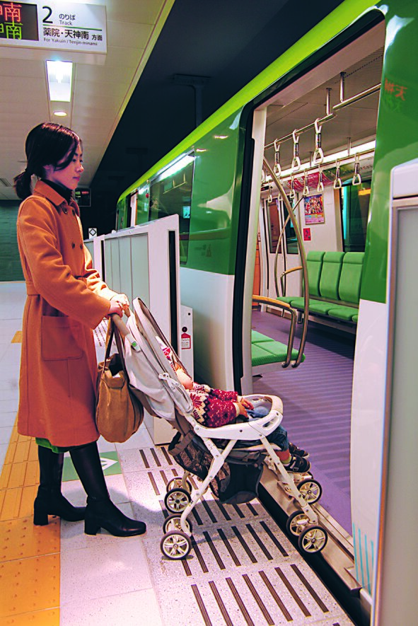
- People with limited mobility: pregnant women, parents with children, older people, wheelchair users, people with other physical impairments and travellers with heavy loads.
- People with limited ability to access information: foreign visitors who did not speak Japanese, people with visual or hearing impairments, people with cognitive impairments, older travellers and children.
METHODS
The lead users were brought in for the early stages of the design process during the first year and continually involved throughout the rest of the project. The designers saw their involvement as an essential part of the process and influential in making key decisions.
Detailed research was conducted with them at every stage. Different research tools were used as follows:
- Questionnaires: these surveyed a large sample of people and gave the designers an early understanding of user needs.
- Controlled observation with interviews: lead users were asked to travel through subway systems. Difficulties were observed and logged and individuals were interviewed in situ. Video cameras were used to document this process.
- Evaluation: lead users were asked to give feedback as the designs developed.
INSIGHTS
This research gave critical insights, showing potential areas for improvement. Some selected examples are given below:
Wheelchair users: were not able to cross over floor height changes. They needed more space to move and change direction. Could not reach buttons for lifts or ticket machines that were placed out of reach.
“Information is placed too high for me to read”
Older people: could not walk quickly or for long distances. Needed resting points. Could not read small text and did not like confusing information. Needed more time to orientate themselves.
“I need more time when walking”
Pregnant women: had difficulty moving and perceiving floor height changes or irregularities.
Foreign visitors: did not understand Japanese behaviour or patterns of movement in public spaces. Information in Japanese typically excluded this group.
DESIGN PROCESS
The design objectives were to create an environment with good mobility and fewer barriers, as well as information that could be easily understood by everyone. A large number of staff worked to solve the different problems on the stations, subways, cars and information systems. Guidelines were formulated for the team to ensure an Inclusive Design approach at all stages.
Considerations in the design process included:
- Design policy
- Concept formulation
- Architecture
- Sign design
- Basic design for a standard station and fleet yard
- Station operations equipment and car design
- Advertising and PR
- Implementation and construction management

RESULTS
The design solutions concentrated on six areas. A few improvements are mentioned under each:
- Universal movement lines
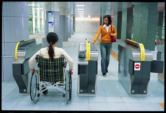
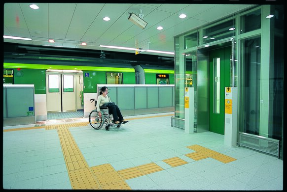
Station layouts allow passengers to move freely through the architecture using the shortest route possible. Entrances and exits always have an elevator or escalator and subway cars equipped for wheelchair users stop by the elevator. The height difference and gap between the platform and subway car are minimal. Getting on and off is safer than other systems. - Universal facilities
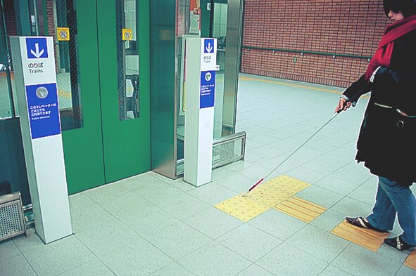
Ticket machines are mounted lower than usual to accommodate wheelchair users as well as standing passengers. They are angled upwards for easier access. The magnetic tip of the white cane carried by visually impaired users automatically calls the elevator and opens the doors via sensors. Accent colours have been added to stair edges to make them more visible. - Universal walkways
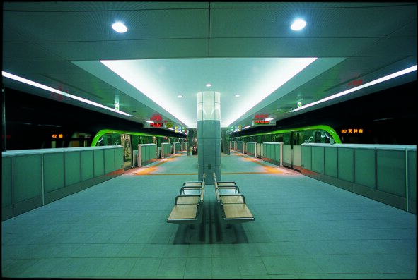
A number of design features make the narrow dimensions of the subway less noticeable and the stations brighter and more comfortable. Large atriums and transparent materials are used to bring natural light underground and provide a feeling of spaciousness. - Visual information
The colour green is used to identify the Nanakuma line from entrances at street level to ticket machines and bathroom walls. - Individual station information
Each station has its own colour, wall material and unique symbol making it easier for children and non-Japanese speakers to identify. The symbols use animals, plants or everyday objects that are instantly recognisable. - Universal signage
Children and wheelchair users have a lower eye level than standing travellers so signs are positioned at a height midway between the two. Audible signs direct visually impaired people, removing the reliance on difficult-to-recognise Braille.
Overall, this in-depth, people centred approach helped the designers to innovate in a very cost-effective manner and invent creative solutions. The Nanakuma line has attracted worldwide attention and won several awards as an Inclusive Design exemplar. It is in daily use in Fukuoka, Japan.
