Commissioning party: Sbanken
Practitioner: Bleed AS

Photo: Bleed
Nice and easy
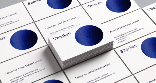
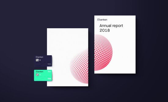
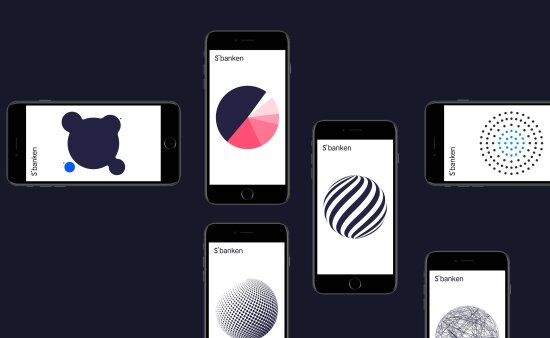
Norway’s first digital bank, Skandiabanken, has moved away from its Swedish mother to become its own Norwegian brand listed on the Oslo Stock Exchange. The occasion was marked by a new name and graphic profile adapted to a digital everyday life that has changed dramatically since the bank launched its server in 2000.


Panel remarks
It is always a challenge to redesign a solution that already functions well, such as at Skandiabanken. The goal was to refurbish while maintaining the service in a way that would not disgruntle existing customers, while at the same time attract new ones.
Sbanken is a brave redesign in which the visual identity is firmly anchored in the brand’s core values. The role of the design as a strategic tool is highly deliberate and the result is a simple and refreshing identity with a clear user-friendly focus. The bank has chosen to differentiate itself from the competition, resulting in a reliable and solid position.
Sbanken is also benefitting from the redesign in terms of both new customers and a favourable reputation.
Project group
Svein Haakon Lia, Bleed AS, Creative Manager
Madeleine Skjelland Eriksen, Bleed AS, Designer
Marie Steen, Bleed AS, Project Manager
Kjell Reenskaug, Bleed AS, Strategic Consultant
Rolf Gjertviksten, Apeland, Strategic Consultant
Anders Fabritius, Racecar, Animation
Joseph Hodgson, Racecar, Animation
Franck Aubry, Racecar, Animation
Hinda Fahre, Palookaville, Photography
Johnny Anderson, Sbanken, Project Owner
Leif-Kjartan Bjørsvik, Sbanken, Communication
Øystein Gjærder Bruvik, Sbanken, Project Manager
Andreas Øye, Sbanken, Design and User Experience
Håkon Leinan, Sbanken, Design
Anna Valland, Sbanken, HR / Organisational Development
Nina Dyrøy, Sbanken, CSR

