“I think this profile won because it is so adaptable in various dimensions and media, from moving digital images to physical spaces and 3D. It also touches on the various disciplines represented by DOGA and their different methods of expression. We are particularly pleased about winning with an identity that represents our own industry and in a competition with so many strong candidates,” says Marc Ligeti, Lead Graphic Designer at Creuna.
Jury comments:
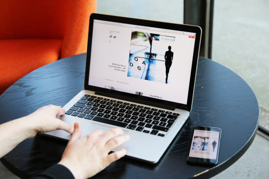
The concept behind DOGA’s new profile brilliantly pushes the envelope for identity design. A design with a focus on moderation and simplicity ensures that the four letters in the organisation’s name function as cornerstones, which in turn paves the way for experimentation in the fields of design and architecture. The logo has good multidimensional qualities and is adapted to various types of media in a surprising and exciting way. It moves seamlessly from paper to directional systems, from the Internet to mobile phone, and every new application creates room for interpretation. The identity is solid, yet continuously evolving. It elegantly welcomes the interpretation of the beholder: it engages, invites curiosity and inspires.
Focus on design methodology
DOGA is the result of a merger between three separate organisations and had a strong need to find a new and clear direction for the new organisation. They wanted a design methodology that would take centre stage in the process of creating a new platform, both strategically and visually. The designers were involved in the work from the very start, from the development of the brand platform and value proposition to the final visual profile and logo. The process as a whole has ensured that the new identity is at the heart of DOGA’s new strategy and in this way can contribute to helping the organisation achieve its goals as a unified entity.
Creating opportunity
DOGA has taken on the task of facilitating learning and experimentation in design and architecture. The goal is to draw attention to the industry, not itself. The new logo reflects the mission to create opportunity instead of to command attention.
Digital media served as the point of departure and this has resulted in numerous opportunities to take a multidimensional approach. The four letters in the name are like four cornerstones that unify and create structure. The logo interacts with the surroundings. It can be put into perspective and used in both 2D and 3D, integrated into still images and living images. It is experienced as organic and in continuous motion and reflects the fact that DOGA must innovate continually in order to aptly reflect the industry and disciplines.
Photo: Eirik Evjen
Creuna team
Design – Marc Ligeti
Design – Heidi Bakken
Design – Stein Øvre
Design and front-end development – Asbjørn Hegdahl
Creative direction – Stein Sørlie
Consultancy – Kristine Ildahl Bjørnstad
Project management – Lisbeth Fasting
3D – Bjørn Endre Langeland
3D – Sindre Martin Dahl
Director of Communications Susanne Ringdal was the designated contact at DOGA.