PROJECT NAME: Dansens Hus
NAME OF CLIENT: Dansens Hus
PROJECT COMPLETED BY: Neue Design Studio
Discipline: Visual communication

Moving letters
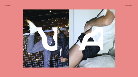
Dansens Hus is Norway's national stage for dance whose goal is to make the art of dance more attractive and visible to the larger society. In order to communicate more clearly and promote itself as Norway's leading contemporary dance institution, Dansens Hus wanted to sharpen its brand image, partly by renewing its visual identity.


Panel remarks
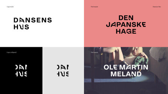
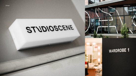
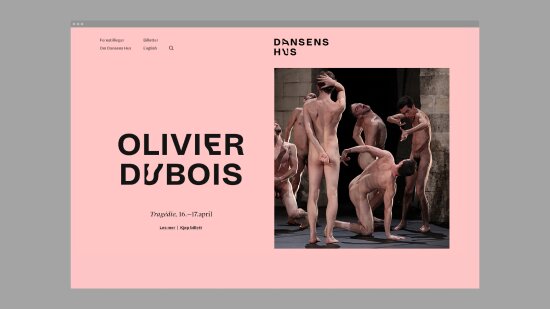
Sometimes, simple is the most difficult. Choosing to take a font as the starting point for Dansens Hus rather than photography or graphics was clearly not the path of least resistance. How much better then that it turned out to be such a success. Based on the font Dia from Schick-Toikka, Neue has made a whole neue (pun intended) font for Dansens Hus, which they call “Dia Dans”. The result is a very recognisable and visible profile which works superbly in all formats – digital as well as printed – and which gives Dansens Hus a distinctive expression of its very own.
Project participants
Erlend Tangen Istad – Neue Design Studio, digital lead, senior designer
Henrik Wold Kraglund – Neue Design Studio, designer
Lars Håvard Dahlstrøm – Neue Design Studio, creative manager, senior designer
Gørill Kvamme – Neue Design Studio, consultant
Trine Renate Dolmen – Neue Design Studio, project manager
Nora Beate Bremnes – Neue Design Studio, designer
Fred Carlsen – Sjelfull, front-end developer
Un-Magritt Nordseth – Dansens Hus, artistic and managing director
Erik Årsland – Dansen Hus, communications manager
Karianne Skåre – Dansens Hus, sales manager
Lars Hamli – Dansens Hus, communications consultant
Tale Katrine Hendnes – Dansens Hus, communications consultant and photography
