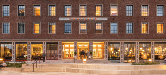
When Nordic Choice Hotels were to start their prestigious project at Solli plass, Bielke & Yang was their first choice of partner for developing a brand and visual identity as they set about restoring the old Oslo Lysverker building for conversion into a world class neighbourhood hotel.
They all agreed on three main objectives for the work:
- Preserving the architecture, artworks and heritage
- Giving local residents a sense of ownership of Sommerro
- Conveying a complex concept in a simple way
The designers started by familiarising themselves with the building’s character, the artworks and the original features internally and externally. They talked to the Norwegian Directorate for Cultural Heritage and worked in close collaboration with LPO Architects and the interior designers from GrecoDeco.
Unique typeface epitomises the brand
The outcome is an ambitious and comprehensive branding programme that reflects a complex hotel concept and a fascinating piece of cultural history.
Sommerro is a hotel, restaurants, Vestkantbadet wellness suite, a stage and a cinema. In order to create a unifying identity, a unique typeface was developed. In this way, the brand has become recognisable by its typography. Illustrations by Bendik Kaltenborn are a leitmotif that adds playfulness and depth to the identity.
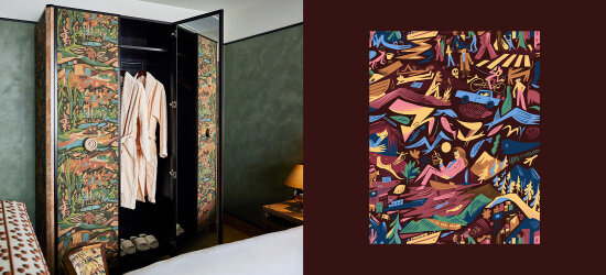
Playful illustrations by Bendik Kaltenborn.
Light, energy and warmth
The Sommerro logo is inspired by ‘The two sisters’ – the name chosen by the building’s original architects - Georg Eliassen and Andreas Bjercke - for what was to become Oslo Lysverker’s new offices. The motif reflects the women featured in Per Krogh’s mosaic at Vestkantbadet, and the design is based on Gustav Vigeland’s iron gates in the nearby Frogner Park.
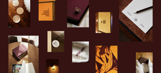
The red colours and the golden tones of the profile are inspired by the design feature in the entrance, which reads ‘light, energy, warmth’.
Long before the hotel had been completed, the designers launched a campaign directed at local businesses, the aim of which was to include, generate enthusiasm, and build a good sense of neighbourhood.
Designed to withstand the vagaries of time
Sommerro’s visual identity allows for playfulness as well as gravity. It was developed to be in tune with different people and needs, whether it be families on holiday or work colleagues attending a seminar.
Sommerro hotel shows how old buildings can be rehabilitated and adapted to modern needs. This is precisely the concept that is reflected by the brand and visual identity.
With great respect for the past, the designers delved into the history of the building and the neighbourhood. They have developed a rich visual universe that conveys Sommerro’s identity at any scale ranging from the very large to the tiny – from promotional material to fabrics and cutlery.
The visual communication appears timeless. It conveys a stable and rounded concept, designed to withstand the vagaries of time.
Recipient of the DOGA Award
This project has received the DOGA Award for Design and Architecture for its outstanding qualities and for showing how strategic use of design and architecture creates important social, environmental, and economic value.
These are two reasons why this is an exemplary project:
- Revitalises the cultural heritage
Sommerro’s identity continues and revitalises an important architectural, cultural and social heritage.
- Boosts local business
The project and the building of the brand strengthens the area’s identity and stimulates local businesses and new investment in the neighbourhood.