St. Olavs Hospital
This patient centred hospital and urban identity project used Inclusive Design principles to define co-design strategies and set new standards for a 21st-century healing space. It covered the redesign of the existing property, as well as the construction of new buildings and spaces.
Client: Helsebygg Midt-Norge
Architects: Team St. Olav (Nordic Office of Architecture,
Ratio Arkitekter), Trondheimslaget (Studio 4 Arkitekter, KHR,
Per Knudsen Arkitektkontor), Frisk Arkitekter
(Nordic Office of Architecture, Niels Torp Arkitekter, P.l G. Kavli), Ratio Arkitekter and Asplan Viak
Background: St. Olavs Hospital was opened in 2010 after 15 years of construction, a complex project with both the redesign of protected old buildings and new constructions.
Numbers: 250.000 square metres in total, each section between 20-40.000 square meters, 10 483 numbers of employees, 669,427 polyclinical consultations, 1732 students of which 40 are doctoral theses
Lead users:
Patients, hospital employees
Methods:
User forum, users in planning meetings, on-site visits, user surveys,
workshops, evaluation, co-creation
Awards:
Winner of both the category for Architecture and for Landscape, as well as the main winner of the Innovation Award for Universal Design in 2014. Since the opening in 2010 the new hospital has gained international recognition and won several awards for innovative architecture that unites nature, urban environment, staff and patients in an unconventional way.
+35%
Increased activity without the need for more staff, since 2010.
Liv Haugen, Medical Director at St Olav’s Hospital, talked about the importance of putting the ideas and visions of Inclusive Design into practice and formalising mechanisms on the project. The approach meant taking into consideration a range of human issues, including visual, hearing, mobility and cognitive impairments, as well as allergies and sensitivity to the indoor climate and materials. Patients can have reduced abilities and increased sensitivities, even if this is temporary. The application of Inclusive Design in this context is therefore more critical than for other buildings. The project began before the Norwegian legislation was put into effect (namely the anti-discrimination law and building requirements labelled TEK 10), so the project team wrote its own guide, entitled Good for Everybody – Necessary for Some.
This document contained recommendations from different user organisations and was incorporated in the project as a contractual document. Today there are a number of formal requirements and standards for Inclusive Design, but to achieve the exemplar solutions that can be seen today, the project team did much more than simply meeting minimum requirements.
CHALLENGE
In 1995, an international competition for a new hospital in central Trondheim in Norway was announced. The client, Helsebygg Midt-Norge, had the bold vision of a hospital design that was driven by the needs and perspectives of the patients.
The resulting architecture received international acclaim for its novelty, innovation and inclusivity, whilst setting a benchmark for bringing nature, the city, employees and patients together in a holistic and harmonious way. As is the case with other types of public buildings, hospitals can come across as large and unfamiliar, with sterile décor and a complex layout of space across multiple floors. When setting a brief for these buildings, the key focus is usually on functionality and operations. However, this new hospital concentrated on the human experience.
The aim was to develop a space that was accessible and attractive and to create processes to embed this at all levels and throughout all phases of the project.
The challenge was to apply people centred design to a complex, long term architecture project.
LEAD USERS
People are at their most vulnerable when ill, and in this state the environment and surroundings can have an exaggerated mental and physical effect. This directly influenced the planning of the buildings, the interior and the outdoor spaces. Fundamental to the project was the idea of creating a hospital space that emphasised the human scale as well as the architectural scale in its design. The vision was to make the hospital a pleasant and welcoming place for patients, relatives, employees, students, clinical staff and the locals.
Inclusive Design at St. Olavs Hospital was applied not only to the architecture process, but also the decision-making framework. A set of priorities to enable this was laid down from the start and then embedded in the project at all levels. One example was the principle of seeing patient participation as important as staff participation, something that was unique to such a complex hospital project. Limiting engagement to hospital employees would restrict insights to work routines and operational functionality, and miss the innovation that results from understanding the human perspective of patients, their families and other visitors. Patients typically place more emphasis on emotional needs and are in a critical state that requires empathy and sensitivity. The involvement of a range of stakeholders brought together professional points of view with personal aspirations, resulting in more imaginative, game changing ideas. Not every architect can be an expert on the functionality of a hospital, so they need to consult with those who have specialist knowledge. A user forum was established that consisted of patients as well as two sets of employees – those concerned with the daily administration and logistics of the building, and those engaged in clinical activities.
Creating solutions for people experiencing difficulties and barriers automatically produces ideas that work better for everyone
Work started with an informal forum initiated by a coalition of various user groups in the region, including The Norwegian Federation of Organisations of Disabled People (FFO) and organisations representing people with conditions ranging from asthma or allergies to those with cancer. Patients and their relatives, as well as employees, contributed to the project guidelines. This then developed into a formal body, the Patient Organisations Community Forum (POFF) that had monthly meetings to address a variety of issues across the project, from inception through to delivery. Even the builders reported to this forum when deviations or mistakes occurred, and new solutions would then be found in consultation with them. POFF also appointed user representatives to the majority of the planning groups, with the exception of highly specialised spaces such as the operating theatres. There were always two users present when meetings took place with the planners, architects and the hospital professionals.
This user group did not exist to simply validate ideas. They were deeply embedded in the project with the power to alter solutions that did not work or were not according to plan. Many on-site visits were conducted alongside the project teams and the group also influenced decisions ranging from the Art Programme to furniture procurement. There was some exception for areas such as specialised medical equipment. The experience gathered during the first stage of the project benefitted the next two stages, with Inclusive Design incorporated in the contractual documents.
Inclusive Design means that ‘the devil is in the details’. If you do not follow-up and watch carefully all the way, you end up with a building that was well planned but with important details that do not work
INSIGHTS
The user surveys that were carried out with patient groups revealed three main desires: privacy, availability of staff, and accessibility. Patients were primarily concerned with their personal experience, particularly protecting their privacy at the hospital, as they had a general feeling of being invaded and boundaries were difficult to maintain. Security and safety were important, with a desire to have appropriate hospital personnel within visible and easy reach. The general accessibility of the buildings and spaces were also critical. Access to nature and beauty was mentioned, coinciding with evidence-based research on the positive effect on healing, and the importance of providing a holistic and human experience.
Human as well as architectural issues were key to the process. Therapists and specialists were involved in creating solutions to increase awareness around patient privacy and maintaining personal boundaries, and these directly influenced the design of the space. Even detailed interactions were considered, such as helping the doctor maintain eye contact with the patient rather than staring into charts or digital devices.
This process of continuous user involvement through meetings, workshops and on-site visits revealed a large number of insights, increasing the innovation value of the project and ensuring that the people-centred vision of the project drove the creative process.
APPROACH AND PROCESS CONCEPTUALISATION
When the project started in 1995, comprehensive plans for every aspect of the design were drawn up alongside guidance for implementing Inclusive Design throughout. Importantly, there was political backing for the vision of a patient-oriented hospital, and this drove the project architects to take a people-centred stance from the start. Early-stage research lead to the three main strategies: firstly, applying evidence-based design; secondly, a non-hierarchical organisational structure allowing decisions to be made by both patients and employees; and thirdly the definition of an area called environmental aesthetics looking at the relationship between health, people and the physical surroundings, and drawing on research areas such as architecture, psychology and neurophenomenology.
Based on these, the team developed principles, guidelines and decision making criteria. These principles were followed by the various architects, designers and other partners who worked on the hospital project and were also embedded in the contracts of the suppliers.
The project enabled Inclusive Design by having it as a contractual requirement for everyone involved. In practice, this meant that patients, families, hospital staff and user organisations were mandated to work with the creative and construction teams throughout. Other stakeholders included consultants, operations/logistics staff and administration.
In summary, the user groups could be divided into three main segments (forming three circles): be (patients) – do (medical staff) – operate (operations/logistics/administration). Conflicting interests could be addressed and solved by involving all parties.
Establishing the concept of Inclusive Design at the initial stages has been crucial
CREATE
Based on initial research with different stakeholders, a brief was defined along with the design guide, forming a basis for project decisions. The motto was “the patient in focus for all decisions”. Following on from this, several manuals and handbooks were developed to ensure consistency and guidance from all the project parties involved.
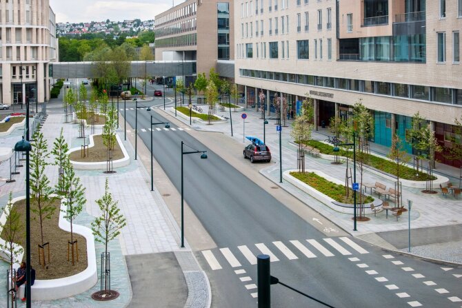
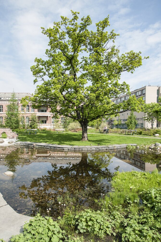
For example, the landscape architects adopted a patient perspective and followed the Inclusive Design guidelines to design surroundings that enable treatment and rehabilitation, and adapt to various needs and preferences. It was important to create variation at a human scale within the outdoor environment, including the park, back gardens and the streets between the buildings. The designers immersed themselves in the patient experience to gain deeper understanding of how the physical surroundings can best enable treatment and healing.
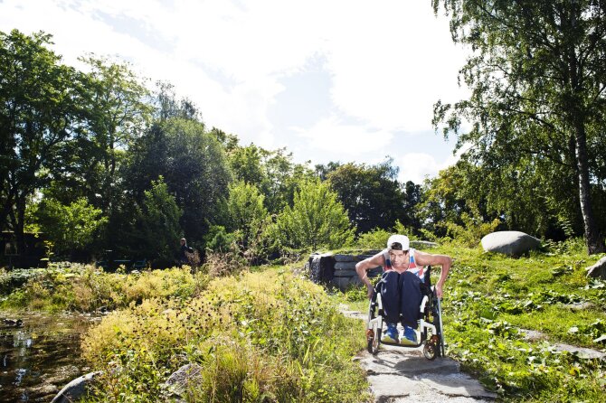
The plants were selected in consultation with the Norwegian Asthma and Allergy Association and a training path was created for wheelchair users in one of the parks to support rehabilitation. Giving people choice is an important element of Inclusive Design, as very different needs and abilities need to be accommodated in alternative ways. The landscape architects went beyond the accessible and functional to create witty and delightful spaces such as the “secret spot” by the river with an elevated bridge to create alternative access to the views.
CONSTRUCT
A challenge for the architects was to operationalise the vision and goals set by the client from a masterplan level right down to details, whilst keeping the patients in focus.
We incorporated the philosophy of a patient focused hospital into the big picture and the masterplan, which guided us to a solution that put emphasis on human scale
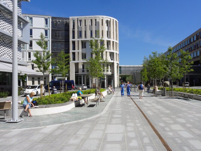
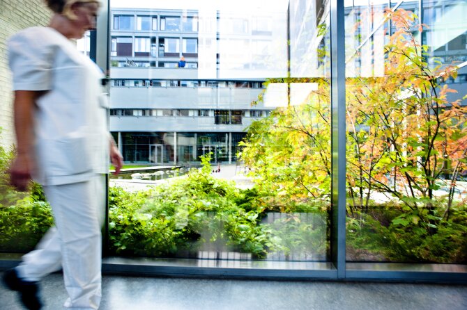
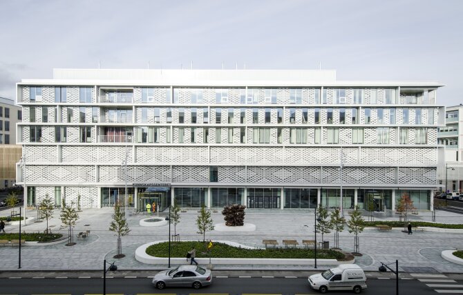
This meant avoiding a megalithic structure and facilitating easy and intuitive navigation instead. If these elements are designed successfully, there is a reduced need for signage or wayfinding. The medical area was organised into six organ-based blocks, each containing two to six floors, so that they had a much smaller scale and looked more approachable than institutional. The main square allows visitors to see the layout and easily orientate and reach the six blocks, regardless of their ability or age. The six blocks all have a welcoming facade at street level with a staffed and open reception area backing onto a garden that is visible through full-length windows. The architecture aimed to create positive feelings and reduce stress, fear and anxiety.
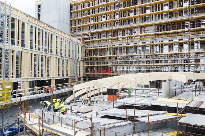
As some old hospital buildings had to be torn down, the project developed in three stages: a sequence of tearing down, building new, then moving in. The project was very complex, due to the technical and functional requirements as well as size and scale. With so many opinions to consider from the user meetings it was beneficial to have the same people involved throughout. Added to this was a range of technical information, components, design elements, functional requirements and medical equipment that had to be considered. The team had no choice but to keep the process simple.
Central to the Inclusive Design approach at St Olav's is the importance of human contact.
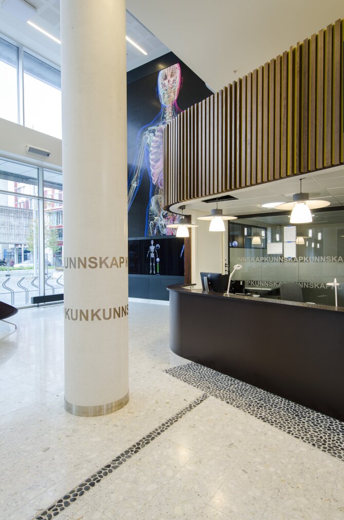
There are people to greet and orientate at the reception, and to help in any other way that is needed. The architecture supports good service, continuing into the square and throughout each building. Because the buildings are designed at a smaller scale, visitors are not lost in a megastructure of endless glass. They find their way easily, and both elevators and stairs are within direct reach. The signage, personal service, orientation board and the back garden all provide focal points, and are accessible and intuitive solutions. The environments are easy to read, architectural planning principles are incorporated and are applied equally across all the six blocks. They look different, to help differentiate between each building, but they work the same way. Orientation is not just about signage. Floor-to-ceiling, distinctive and colourful wall art on the first floor is visible from the garden, providing iconic yet artistic wayfinding. Art is totally integrated as a functional element in the fabric of the building.
Accessibility is not just about entering the complex; it is also the ability to access the environment and the world around. It is about understanding that the real customer is the patient, not just the hospital owner, health service, staff or builders. Patients lie in higher beds than at home to facilitate treatment, so giving sight-line access to amazing back gardens, lush green parks, natural green surroundings, and the sky above is incredibly important and forms a key part of accessibility. The wards have big windows, many of which are full-length, and benches built into the window sill enable this.
User groups were even involved in the detailing of the reception area and the desk, with organisations and individuals consulted in meetings at early stages to define design principles and criteria, and later during workshops to assess and input into sketch ideas and concept drawings. A series of on-site visits also showed a 1:1 prototype for further evaluation and co-creation. These are typical examples of how people were involved at different stages and levels.
The architect also had their own Inclusive Design champion in the final stage of the building project. The process was anchored by the senior management with this champion ensuring that important documents were communicated to all contractors and sub-contractors involved in engineering, construction and completion.
The client, Helsebygg, had their own Inclusive Design project advisors who functioned as watchdogs. On-site accessibility inspections with the user committee were conducted when installations were ready with all interior elements mounted.
As soon as you are inside the building you see continuity, and contact with the outdoors. You know immediately where you are, and can orient yourself using daylight and the natural views
SUCCESS CRITERIA
The project success can be summarised using the following six criteria. Together, they form a set of goals for almost any complex architectural scheme involving Inclusive Design. They are:
- Start with a clear vision and a set of goals
- Involve a diversity of users throughout the process
- Develop guidelines and principles
- Project management commitment
- Interdisciplinary collaboration and close follow-up
- Dedication and a high level of competence
Liv Haugen, Medical Director at St Olav’s Hospital summed up the lessons learnt as follows:
You need to start with a clear vision where Inclusive Design is written in from the start as a fundament. It must then be anchored throughout the project. This is part of the planning criteria, so develop a set of clear guidelines that are incorporated in the contractual documents. Users must be involved throughout and all project management must understand Inclusive Design and be on board. Ensure close follow-up on the building site to make sure that there are no deviations. The client also needs Inclusive Design competence within its own organisation and good advisors, who understand the client and the project, will ensure a smoother process. Someone watching what the project team are doing and following-up to ensure a good overview and a sense of rigour. This could also be the users themselves. Finally, good collaboration, communication and teamwork across disciplines, the client, builders and other interest groups, are essential for success.
We are going to make the patient’s healthcare - nothing about me without me
SUMMARY
Making Inclusive Design a priority at all stages to the entire medical district becoming open to the neighbourhood and a destination in itself. It reframed the possibility of what a hospital could be for the city. The result is a high level of satisfaction for patients, relatives, students and employees and a hospital area that has become an attractive gathering place for citizens as well as students.
The project was innovative in 125 integrating Inclusive Design to the landscape planning throughout the project. The landscape architects have been very thorough in gaining an understanding of the surroundings from the perspective of the patients themselves.
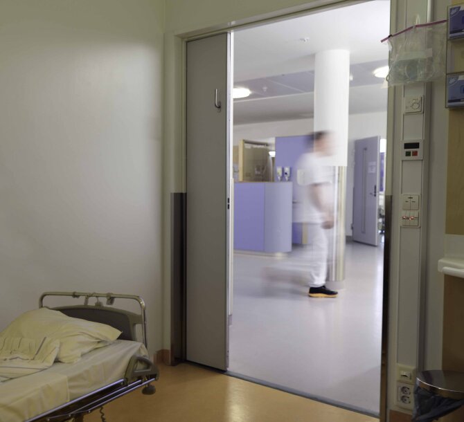
Each ward has been built as a hub, with eight single rooms located off an easily accessible open staff station. The sleeping areas are placed at higher levels in all the six building blocks to ensure uninterrupted views of the nature outside. The concept combines architectural and organisational considerations, and gives increased security for both patients and staff, the patients sleep better and employees have a better overview. The single patient room set a new standard for hospitals in Norway.
One important insight from both the user involvement and the evidence-based design research was: “don’t intimidate, scare or stress the patients, but make an environment that feels normal and safe”. This resulted in the use of natural design and materials such as wood, daylight channels and transparent surfaces to establish a warm and welcoming atmosphere. The Art Programme consists of 2350 pieces that focus on optimising the patient and staff experience and environment. Guidelines for choosing art for a healing space were also developed. There have been countless unforeseen quantitative benefits, both in terms of cost savings and efficiency and qualitative ones such as increased security and better sleep. Research is still being conducted to document and disseminate these effects for knowledge sharing and to benefit other new hospital projects. Despite the additional benefits, the cost per bed is still the average for hospitals in Norway.
We wanted to design a medical district in which streets and spaces create interplay in the hospital, opening it up to the neighbourhood. In addition, it has to be a green area, since the nature and its vegetation stimulate the body and the senses
This complex project consisted of several sub-projects in different and well-planned construction phases, and covered several design and architecture disciplines, in addition to other professional fields, including:
- Urban design and landscape architecture
- Architecture (6 separate units/clinics) – based on health – enhancing architecture
- People-centred design (interior design, graphic design, service design)
- Wayfinding
- Logistics and system-oriented design
- User-centred art (programme)
- Sensory design and neurophenomenology
The new hospital opened in 2010 and has received international acclaim and won several awards.
