NRK – a distinct, vibrant and empathetic visual identity
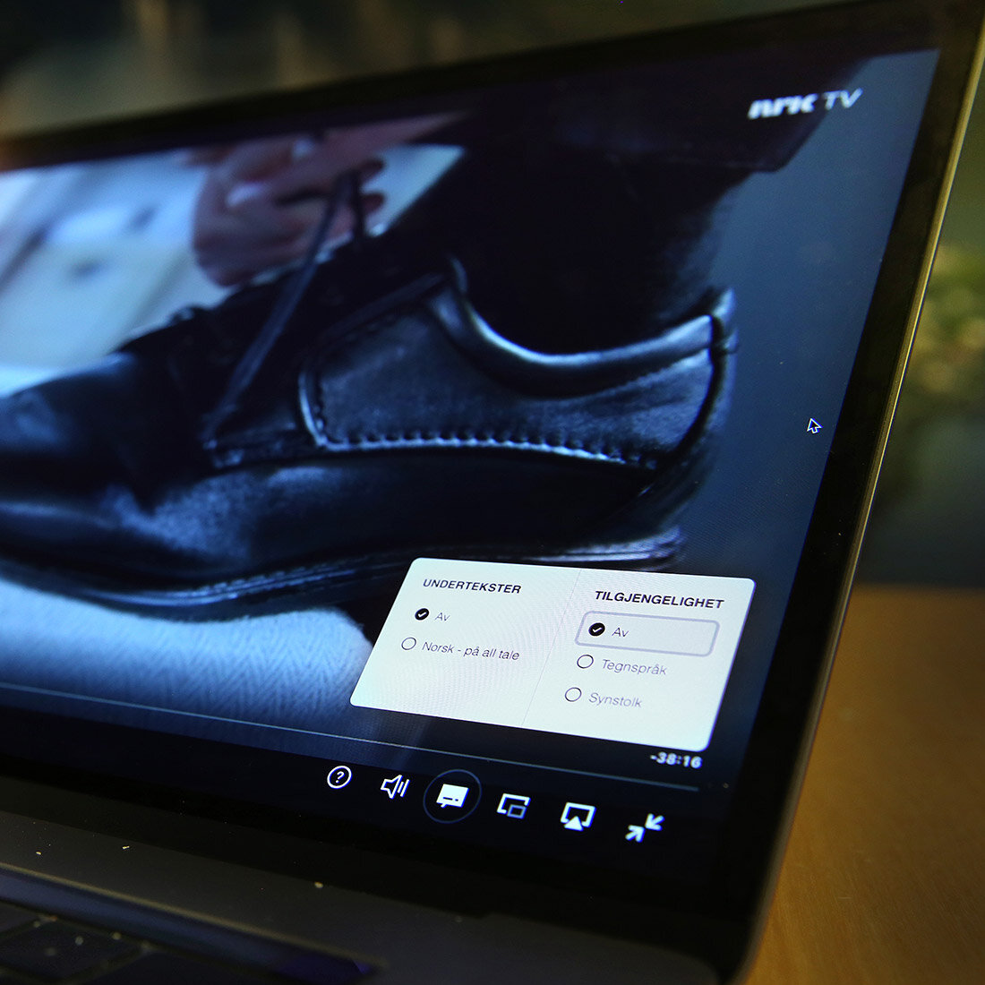
With its new graphic profile, there is no doubt that NRK is ready for the future. Universal and inclusive design alike had to be the foundation for ensuring that everyone in society would be able to see, hear, find and use NRK's content, adapted to their use and needs.
Project owner: NRK – Norwegian Broadcasting Corporation
Design: NRK and ANTI
Collaborators: Typotheque, Heydays, Zelig Sound, Red Bee
Lead target group:
Everyone in Norway, regardless of age or demographic group without exception. This encompasses individuals with visual impairments, all employees in internal departments, and takes into account cognitive abilities across all age groups, and especially children.
Methods:
Research-based insight, consulting, testing.
Awards:
Main winner Innovation Award for Inclusive Design 2023 and category winner Graphic Design (Design and Architecture Norway),
DOGA Award for Design and Architecture 2023
D&AD Awards: Yellow Pencil, The One Show: Merit Rebranding and Merit System, European Design Awards: Bronze: Motion Logo
Visuelt: Diploma
Gullblyanten: Silver Identitet
90 %
of Norway's population use NRK's services every day.
Challenge: How can an iconic brand be made contemporary?
NRK has a special voice in the media landscape and a clear societal role. NRK exists for the public, and the public's use of media content is in continuous, radical change in a global competition. Presence on social media, the shift from linear publishing to streaming, and target groups' changed habits and expectations for new ways of consuming information and content means that NRK must be even clearer as a brand and appear up-to-date and unified in all situations and interfaces where they meet the public, today and in the future.
With this as a backdrop, NRK launched an important, impressive renewal of its profile.
The aim was to come across as a clear, visually attractive brand in all meeting points with its audience. Universal design and inclusive design alike had to be the foundation for ensuring that everyone in society would be able to see, hear, find and use NRK's content, adapted to their use and needs.
NRK needed a graphic profile that was both sufficiently unified to stand as a recognisable marker of identity and varied enough to embrace everything they had to deliver upon; a profile that would give employees a better toolbox and better system for improved solutions and resource management across the organisation and with partners.

Approach: Playing on all the organisation’s strings
It is crucial for NRK to maintain a clear and distinctive visual identity. Design and branding should both articulate and reinforce NRK's mission and goal of strengthening and advancing democracy, enriching Norwegian and Sami languages and cultures, and uniting and engaging everyone living in Norway.
Universal design is essential in representing all voices within society, which places significant demands on the professional quality of every method employed. It also necessitates an inclusive design process that ensures representation and safeguards a diversity of needs and perspectives.
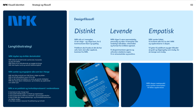
Employees from a wide range of disciplines at NRK - design, scenography, content, marketing, technology, NRK’s user council, accessibility and sound – in addition to representatives from NRK's partners and the design agencies were involved in formulating what was to become NRK's design philosophy – distinct, living and empathetic. This broad involvement in work with the very basis of the design process is innovative in the media industry. The design philosophy has thus become "shared property" in the organisation. This is an important success factor in relation to the final solution and the new graphic toolbox becoming common resources that everyone felt ownership of and wanted to use.
Arriving at the optimal brand architecture for NRK across all channels, services, genres, sub-brands, platforms and applications is a complex task indeed. Each area and category in NRK's media universe have its own user needs. The common goal is to identify NRK as the overall brand and broadcaster and to make the user experience as good and intuitive as possible. User insight and involvement are absolutely necessary and NRK achieves this regularly through profile and brand surveys, user numbers and quantitative user surveys. Emphasis is also placed on qualitative and in-depth insight conversations to uncover challenges and better solutions for users regardless of, for example, age, language, digital competence and various disabilities.
The audience must perceive NRK's visual identity as up-to-date and adapted to the platforms NRK is on, both its own and those of third parties. The audience must experience clarity as to what content NRK delivers and that they can find it easily and effortlessly.
NRK's soul lies in the meeting point between NRK itself and an audience that accommodates everyone. We in the jury are extremely enthusiastic about how NRK has created innovative, exciting tools that enable them to adapt the design profile to each individual target group.
Result: Pursuing empathetic design
NRK brought three core values throughout the process of developing the new graphic profile: distinction, inclusion and empathy. This turned out to be the very basis of the design philosophy and led the way to universal design becoming the DNA of the entire design development.
The meeting point between NRK and the audience is at the heart of the organisation. The primary aim of the new design strategy is an NRK that brings together and engages everyone that lives in Norway, exemplified among other things by the summer bus and ‘Join-in dance’, where NRK is close to people, and the way in which NRK converses with its audience on NRK.no, in relation to news, sports and entertainment events and via all NRK’s other products and services.
The result is a strategy that is realised in the actual design concept. The starting point is the NRK logo, which is the strongest identity marker in the new profile. The basic shapes in the logo form the support structure for the design language. They can change colour and surprise, and allow for a flexible, living expression that is easy to employ in animation, interaction and layout. This is a living, flexible system that provides a multitude of options. From being a static logo, the concept also provides space for both playfulness and flexibility. The shapes and animations are used to support the content or story, and otherwise to ensure good legibility.
NRKs content is of course what is most important, and the design should make this available for the widest range of people. Tremendous flexibility resides in being able to adapt the expression to content, context, age group and issue.
The interface also adapts to age through changing the design language, for example how round or square the shapes should be, the amount of text and colour contrasts. In addition, a great deal of work at NRK is currently being undertaken in respect of personalisation. This provides exciting opportunities for individual adaptation to different user needs relating to accessibility in the future.
Here there are many elements which are informed by the overriding values of inclusion and empathy.
These values are perhaps best expressed in the new font: NRK Sans. The goal was to create a font that could be used in any context; one that was compatible with improved, universal user experience and navigation while simultaneously remaining stylistically true to NRK’s identity.
Font studio Typotheque worked in collaboration with NRKand ANTI to develop NRK Sans. On the basis of research and criteria for success, the studio produces fonts that provide good legibility for everyone. By creating a completely new, easy-to-read font, NRK has gone miles beyond the minimum requirements to fulfil its societal responsibility. They also saved money in relation to the costs of licence agreements.
In addition to the font itself, placement, grid and a validated colour system are crucial for readability and easy navigation of information and content for users.
NRK has developed a grid system, a colour programme and a branding system for programmes, channels, platforms and services that work together to create an orderly whole within which it is easy for users to find their way around and make their design choices.
Global standardisation of design elements provides easier quality control and thus a better experience for users.
A comprehensive toolbox
Extensive collaborative and design work since 2018 has yielded results. The reward comes in the shape of a toolbox full of graphic elements – adaptable and varied for every need.
The NRK logo, the mothership itself, has retained its iconic shape. But it has been given new life through a series of animations that give it a playful kinetic language. The logo has come to life.
The sound of NRK has also been born. It consists of three recognisable tones, affiliated to the three letters: N-R-K. The sound that has been created works across media and services and contributes to strengthening the brand.
NRK has also done a thorough job of ensuring that all the tools work equally well across everything they do on all platforms. The graphic profile is empathetically designed to satisfy the needs and authentic style of everything from NRK Super to NRK Radio, podcasts and news services.
NRK's users, the entire population of Norway, are taken care of and included in the graphic expression.
Viable and future-proof
NRK employees have been given a comprehensive design system and a shared toolbox that increases productivity and creativity.
The toolbox has made it easy for the designers to maintain, further develop and adapt the graphic expression to each situation and production. The graphic design follows people’s lives, with dedicated adaptations for children, young people, adults and the elderly.
And the fact that the graphic profile is easy to develop further gives NRK a long-term perspective which means that the new, up-to-date expression is also future proof.

Benefits: Involved the organisation and allowed ideas to ripen
The implementation of NRK's new graphic profile and toolbox would not have been equally smooth if NRK had not included internal and external users from the start.
The inclusive collaboration means both internal and external users feel a special ownership of the new profile – because they themselves have been part of developing it.
And by involving real users with different functional variations from the start, NRK has gained important empirical evidence and a direction for the project which makes it viable for a long time to come.
Top management was involved throughout the journey – from need and idea to process and final result – so that the project could mature over time and gain the necessary fundament. This was absolutely necessary to be able to make such drastic changes to something as close to people’s hearts and historically unshakable as NRK.
Faster onboarding and collaboration across disciplines in the organisation are also important gains. A shared source and toolbox ensure efficiency and faster interaction in use. The new graphic profile also contributes to better scalability of visual instruments across content levels and reduced costs over time.
Such large projects require patience and stamina. Getting continuous feedback from interest organisations, collaboration partners and internal and external users has therefore been absolutely essential to reaching the goal.
NRK got there, and more: They have broken down barriers and are an inspiration to everyone who develop graphic design and visual tools that both include and excite. NRK leads the way, inspiring many people by means of a unified, universal experience, everywhere.
With empathy embedded in the design philosophy, and thus part of the DNA for all design development, they demonstrate that they take their societal responsibility seriously – in practice.