Making the impossible possible
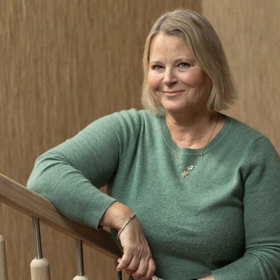
Johan Østengen, landscape architect and partner in Østengen & Bergo AS, explains how it all started. "The property company Høegh Eiendom AS owned the building on the north side of the square, where NAV now occupies new officesdesignedby MAP Arkitekter. The square was previously Schandorffs Gate, which was later redeveloped as a park. Høegh contacted us in the planning phase to design a park. The planning provisions specified that it had to be accessible to all," he explains.
The height difference of seven metres presented a big challenge. The walkway has an average gradient of 1:20 or lower but necessary adaptations to accommodate existing infrastructure meant that it is as much as 1:15 in a few sections.
Schandorffs Gate used to end at a substantial wall – but one worthy of preservation – close to the Deichman Library, a wall that could only be crossed via steps. Johan explains that they decided to make universal design a key driver in the design of the park. "The slope has been designed as a winding walkway in a park. In order to deal with the gradient requirements, the walkway had to pass through the old wall. Fortunately this wasaccepted by the authorities responsible for preservation regulations," he explains.
As well as the height difference, there were a number of other practical challenges. Johan noted that Høegh had originally thought of building a car park beneath the square, so there was no need for the landscape architects to take account of existing drain pipes and other mains systems in the ground, as these would be moved anyway.
"However, when we came to the detailed planning stage a year later, the car park idea had been shelved. This meant that we suddenly had to take account of everything that was in the ground after all. For example, a high-voltage cable runs underground in front of the entrance to NAV. This has now been camouflaged by a fixed timber seating area, which was not originally in the plans and therefore created a lot of extra work."
Exciting materials
Schandorffs Plass emerges as tight, light and modern, yet cosy and comfortable at the same time. The architects have managed to choose a design that elegantly unites venerable old buildings and modern office blocks. The square bears the stamp of simple elegance, and exudes a slightly exclusive air.
Johan Østengen says that they actually took a fairly sober view of the planning process. "We realised at an early stage that it would be a square where movement could be a significant quality. This made the planting an important aspect, including large areas of perennials. We wanted to accentuate Schandorffs Plass using a different colour tone from the city's other squares. Corten steel used for vertical walls in combination with raw concrete, stone, lawns and perennials in various blue tones produced the warm mood we were trying to achieve. Although the assignment was relatively complex, like everyone else we had to think in terms of costs. The materials we've used here aren't particularly expensive, but we've been careful with the details. There are clean lines and lavish contrasts, good navigability, and everything is open and transparent."
A space for everyone
Accessibility for all has been successfully implemented with a large number of rest places for weary walkers. There are handrails and banisters along the walkway and on all the stairs. There are also marked steps on the stairs and hazard warning fields with tactile paving at the top and bottom. Use has been made of natural leading lines such as edges and facades. Next to the walkway and squares, adjacent vegetation and edges in corten steel provide a good visual contrast with the light surface of the slope and serve as guiding elements. Emphasis has been placed throughout on contrast in the colours and surfaces of the materials. In addition, non-slip materials have been used. The furnishing comprises freestanding chairs, so that it is easy for a wheelchair to be included around a table. There is disabled parking at the end of the square.
Inspiring ideas
Johan explains that the people at Østengen & Bergo like to be inspired. "We keep up to speed with what's happening in our profession both in Norway and abroad. We go on study trips and we have employees from other countries. At the same time we consciously try to create our own design and to exploit the broad corpus of ideas our employees possess, something that has come in useful not least at Schandorffs plass. We learn a lot from others, but we never copy."
He says that during the work on Schandorffs Plass they gained valuable input from different user groups, and tests were also carried out involving wheelchair users.
"We are proud of having created a central green space from the starting point we had. There were a lot of details to be resolved, right down to the last turn of the shovel. When the square was finished, Høegh Eiendom donated it to Oslo Municipality, which then assumed ongoing responsibility for maintenance and accessibility for all," says a delighted Johan Østengen.
