PROJECT NAME: Balholm Fruit Wines (Balholm Fruktvin)
NAME OF CLIENT: Balholm As
PROJECT COMPLETED BY: Olssøn Barbieri AS
Disciplines: Visual communication, packaging design
Fruitilicious design
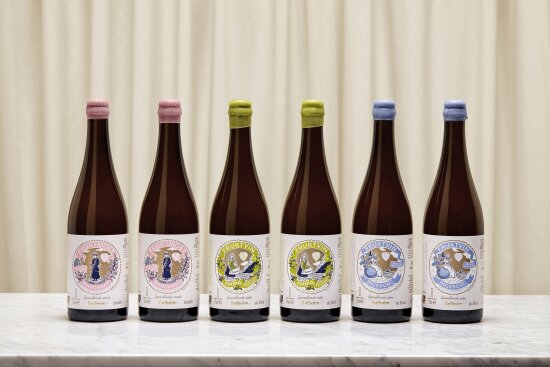
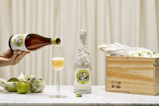
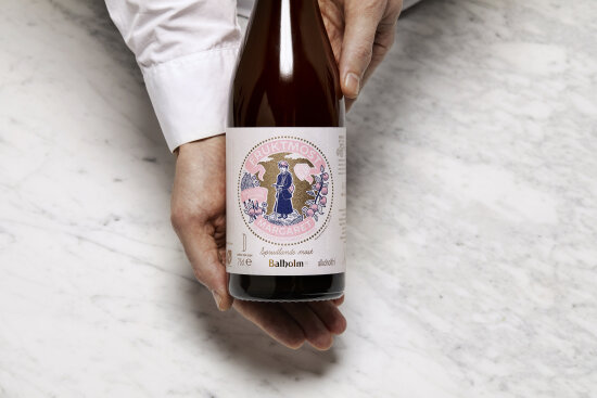
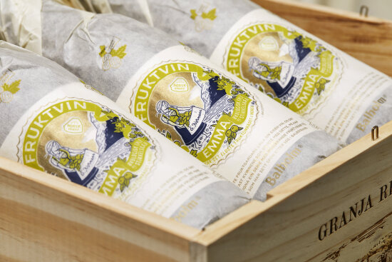
Balholm is a family-run fruit farm in Balestrand, Sognefjorden that was looking to create a new brand platform for its new range of sparkling fruit wines. The goal was to challenge the prosecco/cava segment with a local Norwegian alternative, and they wanted a flexible solution for communicating local stories, anecdotes, and mythology from Balestrand and Sogn associated with fruit.
Panel remarks
Here they have succeeded in creating a very distinctive identity with the story of three strong Sogn women while taking inspiration from old-fashioned illustrative techniques. Everything comes together in a greater whole in which the individual parts reinforce each other: the waxed corks with colour coding hint at the homemade and original, and the silk paper used to wrap the bottles promotes the impression of personal care and local ties.
Old illustrations and printing techniques bring a nostalgic element to the product, but the unexpected colour combinations leave no doubt that this is a modern product. In summary, this work is of high quality in terms of its craftsmanship and design durability, and it comes across as coherent, appealing, and distinctive.
Project participants
Frode Skaren – ByHands / Ugly Logo, illustrator
Stefan Ellmer – typographer